
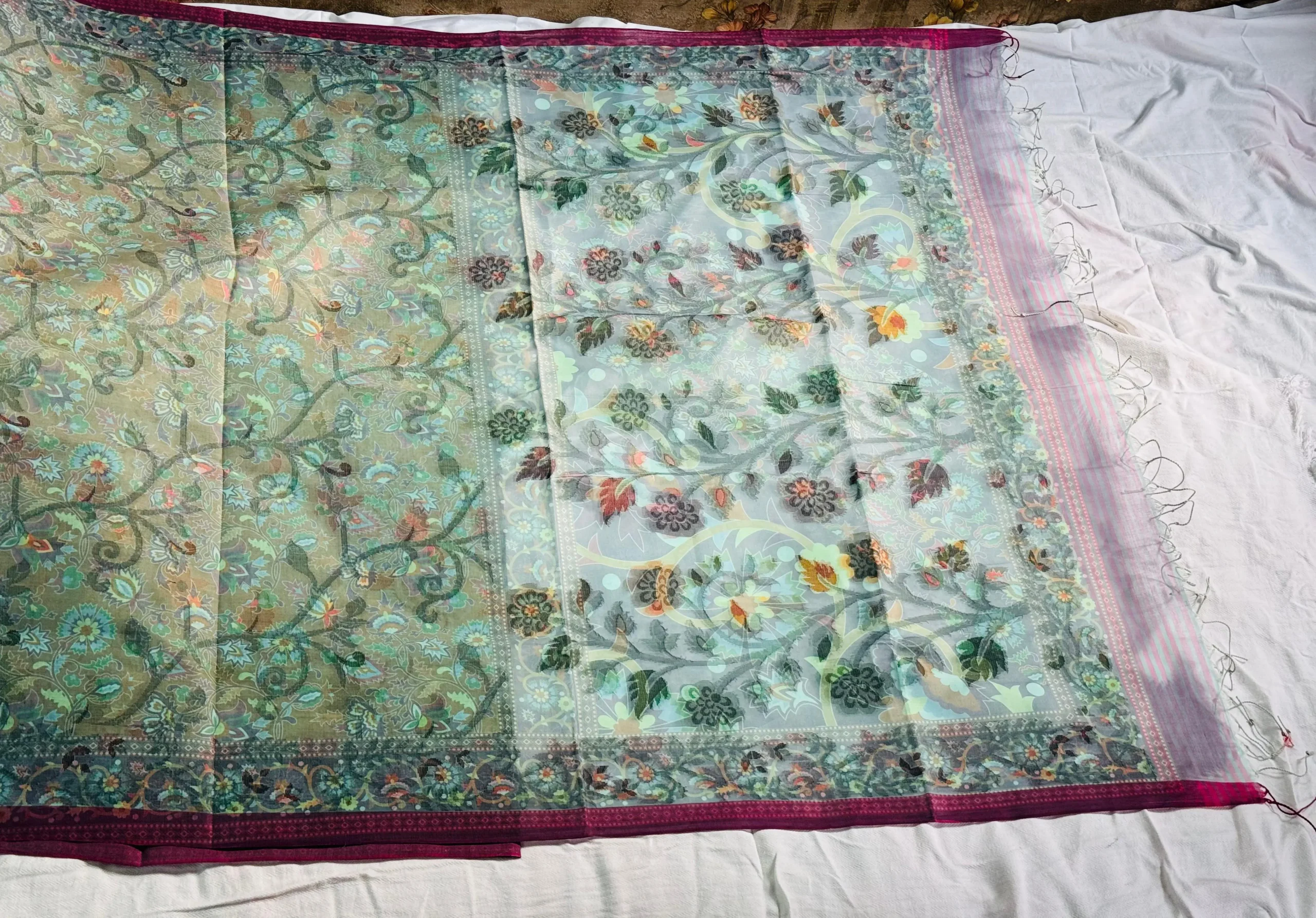
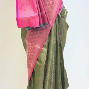
This is a refined version of a dual-tone printed saree—less aggressive, more premium-looking compared to loud contrasts. The color combination (muted olive + soft aqua) targets a slightly more sophisticated buyer segment.
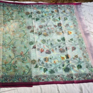
The floral print is dense but smoother in tone, avoiding harsh contrast. This makes it easier to wear and more visually balanced. The pallu section (aqua side) is lighter and more open, creating a natural visual break from the heavier olive body.
Design breakdown:
Color combo: muted olive + aqua → soft contrast, premium feel
Print: floral vines with layered detailing → traditional but toned down
Layout: heavier body + lighter pallu → better visual flow
Border: dark pink edge → adds sharpness and definition
Fabric appears lightweight and semi-transparent, giving it a soft drape and comfortable daily usability.
Reviews
There are no reviews yet.