
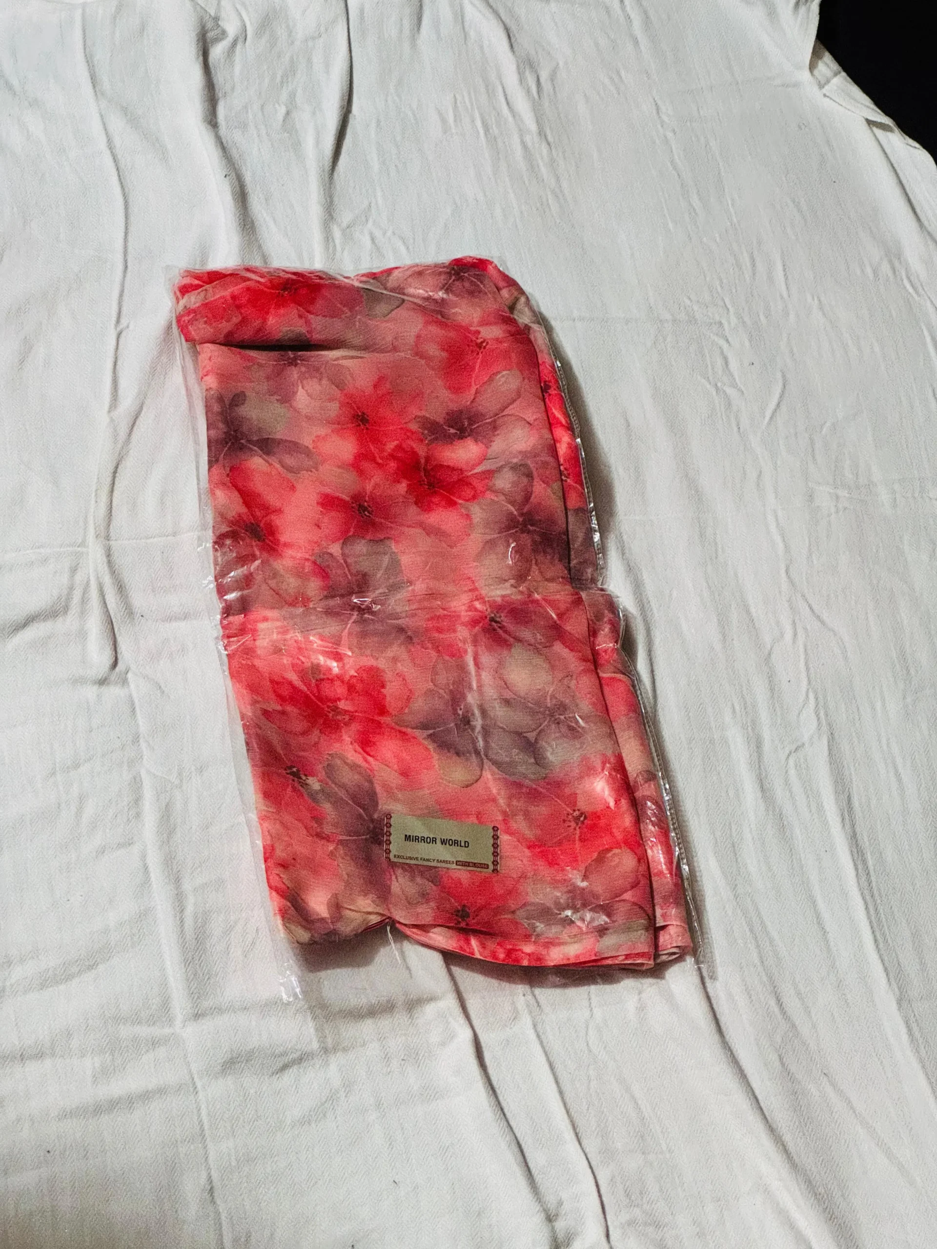
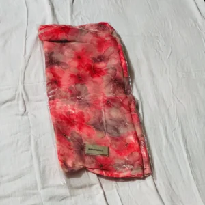
This saree features a coral-red base blended with muted brown and beige floral tones, creating a soft, watercolor-style appearance. The print is diffused and layered, giving it a smooth, flowing visual rather than sharp, high-contrast patterns.
The color combination works well for daytime wear—bright enough to stand out but toned down with earthy shades to avoid being overly loud. However, the lack of defined motifs or structured border reduces its premium perception and makes it less suitable for formal or festive positioning.
Fabric appears lightweight and breathable, making it practical for regular use in warm climates. Comfort and ease of draping are strong points, but this comes at the cost of a more “basic” market positioning.
The saree lacks a strong pallu highlight or contrast border, which limits visual impact in photos and reduces perceived value during online selling. Packaging in plastic further weakens presentation.
Reviews
There are no reviews yet.